Flutter Layouts Guide: Margins and Padding

At the end of this tutorial, you should be able to apply margins and paddings when building your Flutter app layout. You would also understand the difference between margin and padding and the use cases for each one of them.
Introduction
This is a beginner's guide to using margins and paddings when building any Flutter app. If you have some experience building iOS or Android apps, this Flutter's layout should be easy to comprehend. The margin property is used to create space around a Flutter widget and its parent widget or a neighbouring widget. Padding is similar, however, it is used to set some space from the border of a widget and its content. In some cases, padding could be used as a widget property or as a widget.
Setting up a basic Flutter app
For this tutorial VS Code would be used as the default text editor/IDE and an android emulator. I want to believe that you're comfortable setting up a development environment and can also create a Flutter project. However, here is a quick refresher, follow the steps below:
- Launch your android emulator.
- Open a folder for your Flutter project.
- Type out the following command
Flutter create app_name. - Navigate to the project folder
cd app_name. - Locate the
lib/main.dartand replace the code in the file with this initial template.
import 'package:flutter/material.dart';

void main() {
  runApp(const MyApp());
}

class MyApp extends StatelessWidget {
  const MyApp({Key? key}) : super(key: key);
  @override
  Widget build(BuildContext context) {
    return MaterialApp(
      title: 'Flutter Demo',
      theme: ThemeData(
        primarySwatch: Colors.blue,
      ),
      home: const MyHomePage(title: 'Flutter Margins & Padding Demo'),
    );
  }
}

class MyHomePage extends StatefulWidget {
  const MyHomePage({Key? key, required this.title}) : super(key: key);

  final String title;

  @override
  State<MyHomePage> createState() => _MyHomePageState();
}

class _MyHomePageState extends State<MyHomePage> {


  @override
  Widget build(BuildContext context) {
    return SafeArea(
      child: Scaffold(
      body: Column(
        mainAxisAlignment: MainAxisAlignment.center,
            children: <Widget>[

            ],
      )
    )
      );
  }
}
- Launch the app with this command
flutter run.
With our basic Flutter app up and running we can get begin applying margins and padding within our app's UI.
Applying Margins and Padding to Flutter Layout UI
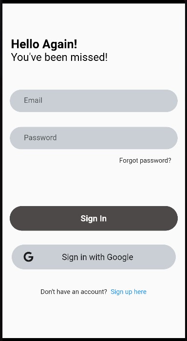
You would be building a simple login user interface to better understand the concepts outlined in this piece of writing. In the end, you should have a screen that looks like this.
Applying Flutter margin
We would add different components and widgets to the column widget children list from our initial template.
    ...
    children: <Widget>[
                Container(
                  margin: const EdgeInsets.only(bottom: 40),
                  alignment: const Alignment(-0.8, 1.0),
                  child: RichText(
                  text: const TextSpan(
                    text: "Hello Again!",
                    style: TextStyle(
                      color: Colors.black,
                      fontSize: 26,
                      fontWeight: FontWeight.bold
                    ),
                    children: [
                      TextSpan(
                        text: "\nYou've been missed!",
                        style: TextStyle(
                          fontSize: 23,
                          fontWeight: FontWeight.normal
                        )
                      ),
                    ]
                  ),
                  ),
                ),// container ends
              ],
The first widget in the UI is the Container widget, with a child widget RichText. The Container widget has a margin property which is applied to the bottom of the widget margin: EdgeInsets.only(bottom: 40) to provide space between itself and the next widget underneath. As you would have known or as you would find out soon, many widgets in Flutter do not directly support the margin property. However, a popular manoeuvre around this would be wrapping any widget without a margin property with a Container widget.
A simple way to apply margin would be using the EdgeInsets constructors according to the Flutter API Docs as follows:
margin: EdgeInsets.fromLTRB(...);creates insets from offsets from the left, top, right, and bottom.margin: EdgeInsets.all(...);creates insets where all the offsets are value.margin: EdgeInsets.only(...);creates insets with only the given values non-zero.margin: EdgeInsets.symmetric(...);
creates insets with symmetrical vertical and horizontal offsets.margin: EdgeInsets.fromWindowPadding(...);creates insets that match the given window padding
Each of the above-listed constructors has its own use case, used as needed. Sometimes you would want to apply a margin around a widget or at targeted parts of that widget like the left, top, right and bottom. Margins are vital for creating beautiful user interfaces. It is very important to understand how it works in Flutter which isn't entirely different from other frameworks.
Applying Flutter padding
The next component in our sample UI is the TextField widget which is used to collect users' input upon login. The TextField, as seen in the code snippet below, is wrapped with a Padding widget.
...
     ),// container ends
const Padding(
                  padding: EdgeInsets.all(16.0),
                  child: TextField(
                    obscureText: true,
                    decoration: InputDecoration(
                      border: OutlineInputBorder(
                          borderSide: BorderSide.none,
                          borderRadius: BorderRadius.all(Radius.circular(30))
                      ),
                      hintText: "Email",
                      contentPadding: EdgeInsets.only(left: 30),
                      fillColor: Color.fromARGB(84, 100, 117, 135),
                      filled: true,
                    ),
                  ),
                ),
The Padding widget has two properties padding and child.
As earlier mentioned, padding can be used both as a property and as a widget in Flutter. As seen in the code snippet above, the TextField widget is wrapped within the Padding widget as its child. However, even used as a widget, the padding property is still applied to enforce the padding.
The padding also implements the EdgeInsetsGeometry class like the margin property. As seen in the snippet, padding is applied around the TextField widget with padding: EdgeInsets.all(16.0) to create space around the child widget.
Padding on widgets could be applied using the EdgeInsets constructors in the same manner like the margins as follows:
padding: EdgeInsets.fromLTRB(...);padding: EdgeInsets.all(...);padding: EdgeInsets.only(...);padding: EdgeInsets.symmetric(...);padding: EdgeInsets.fromWindowPadding(...);
Some widgets don't have a padding property, always remember to wrap them in the Padding widget to achieve some form of padding.
Conclusion
Margins and Paddings are very essential when building a user interface, here are a few things to note.
- Margins and Paddings are some of the properties of the Container widget.
- Some widgets in Flutter do not directly support margins or padding, hence, there will be a need to wrap them with a Padding or Container widget.
- There are different constructors available to you for use when applying either a margin or padding depending on your needs.
To illustrate the use of margin and padding, we started building a simple login UI. The complete code for this can be found in this Github Repo.


